Case Study: Dynamic Sector Analysis for Risk Modeling
Customer need: A decision support engine capable of identifying hidden dependencies during periods of market stress. Traditional risk models, reliant on static taxonomies like GICS (Global Industry Classification Standard), were failing to capture real time correlations. "Diversified" portfolios may exhibit concentrated behavior during selloffs, contradicting their static labels.
The Objective: A system capable of ignoring labels and identifying "empirical sectors", groups of assets that actually move together in real time. We deployed a custom Dynamic Clustering Engine to ingest their market data and uncover these hidden structures using unsupervised learning.
Solution Architecture: Correlation Clusters
To solve the problem, Sabr Research configured a custom clustering pipeline. Instead of relying on preassigned metadata, the system utilized a data driven approach to map the underlying topology of the market. The solution leveraged K Means clustering and dimensionality reduction (tSNE) to visualize real interconnections. Below is the technical breakdown of the methodology implemented for the client.
Data Ingestion
The system processed end of day prices of S&P 500 constituents. From these raw inputs, the engine computed daily log returns defined as:
where is the closing price at date t. This generated a feature matrix where:
- n is the number of entities (stocks).
- T is the number of time observations.
The objective was to extract the latent correlation structure embedded in these series to inform the decision making process.
Computing Correlation Distances
To group similarly behaving assets, we implemented a distance metric based on correlation. For two vectors and , represented by their series and , the system calculated:
This metric provided a clear interpretation of similarity:
Perfectly Correlated
d = 0
Uncorrelated
d = 1
Perfectly Anti correlated
d = 2
To handle sparse datasets (e.g. recent IPOs), we engineered a preprocessing step where entities with insufficient overlapping data were automatically assigned a maximum dissimilarity score (d=2).
Clustering Logic: Finding Empirical Sectors
With the distance matrix computed, the core task was to partition the dataset. We utilized K Means clustering to minimize intra cluster dissimilarity:
Because standard K Means assumes Euclidean distances, which can fail in correlation space, we implemented a modified version of the algorithm. This custom implementation adjusted the centroid update step to respect the specific geometric properties of correlation distances, ensuring stable convergence.
Adaptive Weighting for Regime Shifts
A key requirement was that the model account for regime shifts (e.g. earnings surprises or macro shocks). Classical clustering treats historical data uniformly, which causes "lag" in decision making. To address this, we integrated an exponential weighting module into the K Means engine.
Exponential Weighting Scheme
For a given time series , we applied a weight vector , prioritizing recent observations:
where controls the decay rate. This allowed the system to compute weighted statistics:
- Weighted mean:
- Weighted variance:
- Weighted covariance:
- Weighted correlation:
This adaptation allowed the Clustering Engine to detect structural breaks in the market significantly faster than standard variance models.
Analysis Insights & Results
We validated the model using a two year dataset (September 2022–2024). The weights were set to a half life of 6 months to balance stability with responsiveness. To visualize the high dimensional output for the client, we utilized tSNE projection.
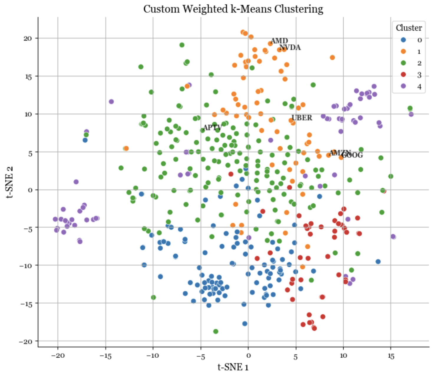
Figure 1: Output from the Clustering Engine showing empirical clusters.
The engine identified a latent "Tech Innovation" cluster containing AMD, NVIDIA, Uber, Amazon, and Google. Despite their divergent GICS labels (Consumer Discretionary, Communication Services, Industrials), the algorithm correctly identified that these entities share a common risk factor. This insight allowed the firm to adjust exposure models to reflect the reality that Aptiv (APTV) and Amazon, though in the same official sector, share almost no behavioral DNA.
Detecting Structural Shifts (Case: COVID 19)
A key requirement for the project was robust change detection. We backtested the engine against the onset of the COVID 19 volatility to demonstrate its adaptiveness.
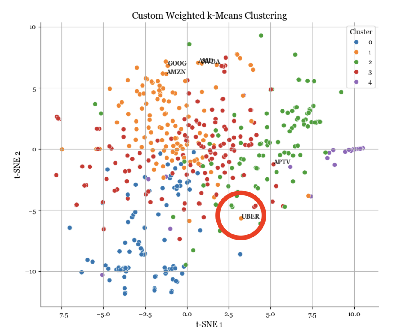
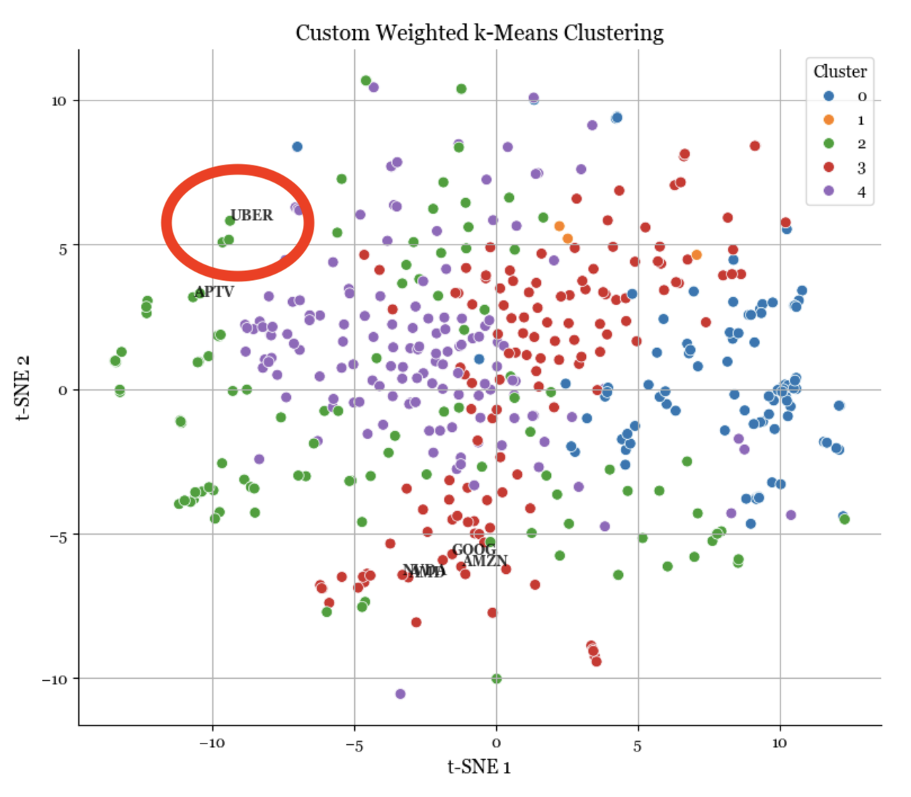
Figure 2: The engine detecting a structural break in Uber's correlation profile (Red) pre vs post COVID.
The visualization confirms the system's efficacy: Pre COVID, Uber clustered tightly with digital tech giants. Post shock, the Weighted K Means algorithm immediately reclassified Uber, reflecting its dependence on physical mobility. This allowed the client to visualize the decoupling of "digital tech" from "physical tech" in real time, providing a strategic advantage in risk management.
Outcome: Empowering Strategic Decisions
By deploying the Dynamic Clustering Engine, the client moved beyond rigid labels to a dynamic, data driven understanding of their environment. This project illustrates the core capability of Sabr Research: implementing advanced unsupervised learning to structure complex data and support high stakes human decision making. Whether in finance, logistics, or corporate strategy, our engines are designed to reveal the reality behind the data.